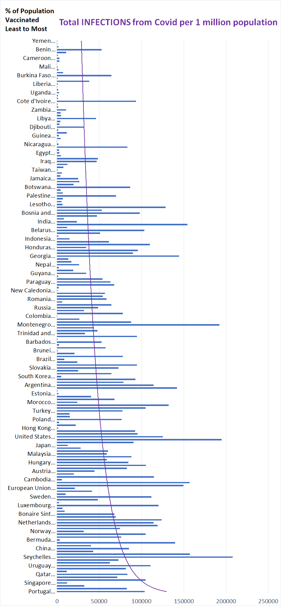
The following graph is the result of data collected from two separate websites: 1) https://ourworldindata.org/covid-vaccinations?country= and 2) https://www.worldometers.info/coronavirus/. I combined the information on the total percentages of the population of each nation that has been vaccinated and matched it to the number of Covid infections in that same nation. I then added a logarithmic trendline so you can see the progression.
You can see the source data file here
Basically, there is a greater tendency of infection in a nation with a higher percentage of vaccinations. However, cause-and-effect are difficult to determine. Is the increase in Covid infections due to the vaccinations, or are the vaccinations increased because of infections? Scientists would have to do a study to see which is the case. Nevertheless, I present this information for your consideration.
Please read the disclaimer. The information I’ve produced here is not to be used for medical decisions.
See also
- Covid vaccine effectiveness & percentages of infection in a population – Video: Youtube, Odysee
- Covid vaccine effectiveness & percentages of deaths in a population
- Covid vaccine effectiveness & percentages of deaths in a population – all countries
Note that the graph below does not SHOW all the countries, but they are all included in the data source. The graph program I used, Excel, included all the data points, but only shows the names of like 1 out of every 3 or 4 countries.